Year
2024
Turning browsing into buying through strategic UX and joyful UI
The Challenge
From cookie-cutter to captivating
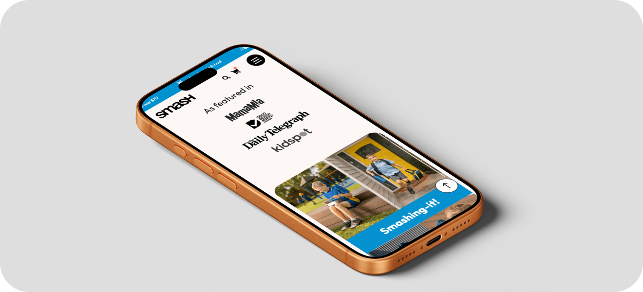
Smash came to us with a clear problem: their existing website wasn't doing their brand justice — and it wasn't converting. The site felt generic, lacked personality, and didn't showcase the quality, sustainability, or design-led nature of their products.
As Smash entered a new phase of growth, they needed a website that felt fun, memorable and unmistakably them — while still being easy to navigate, intuitive to shop, and optimised for conversions across desktop and mobile.
We designed an experience, not just a website
What we did
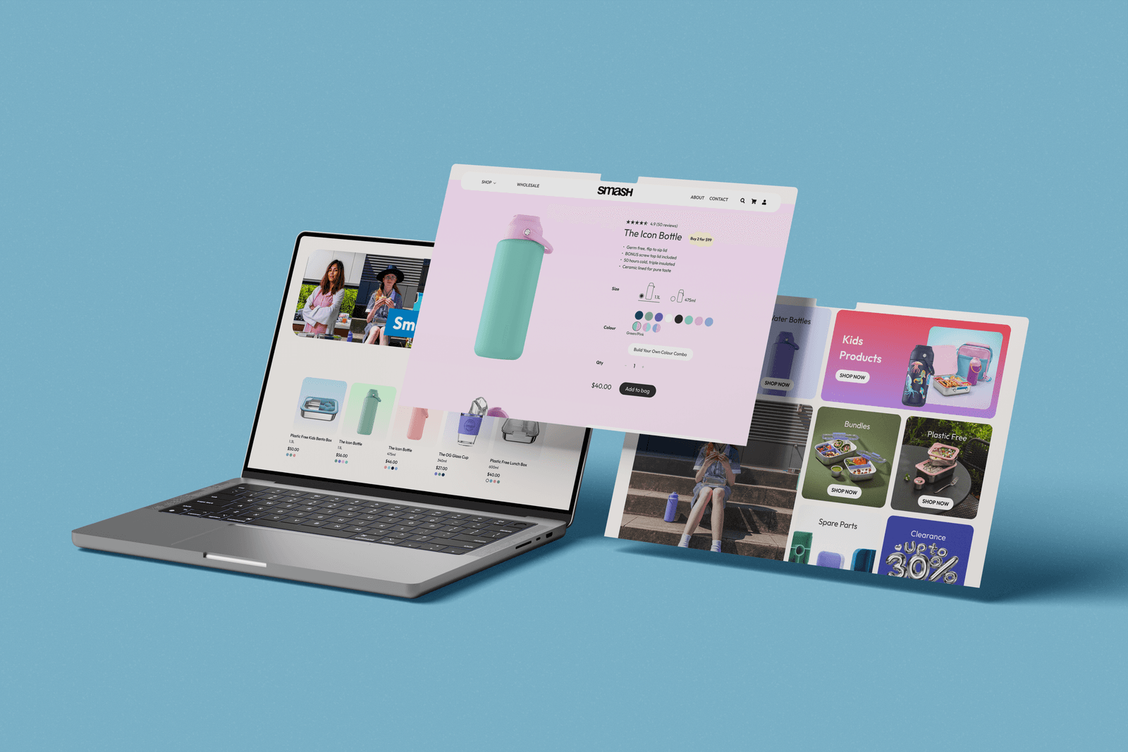
With full creative freedom, we rebuilt the Smash website from the ground up, balancing bold, playful visuals with clear UX strategy.
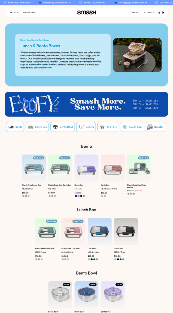
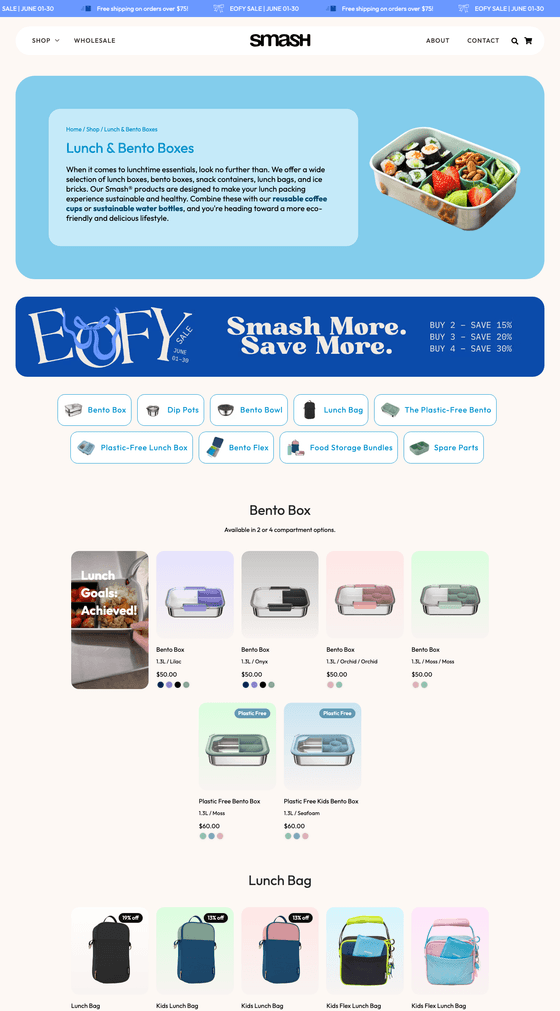
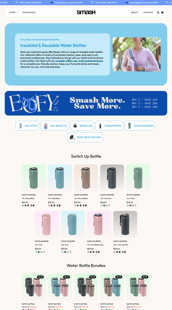
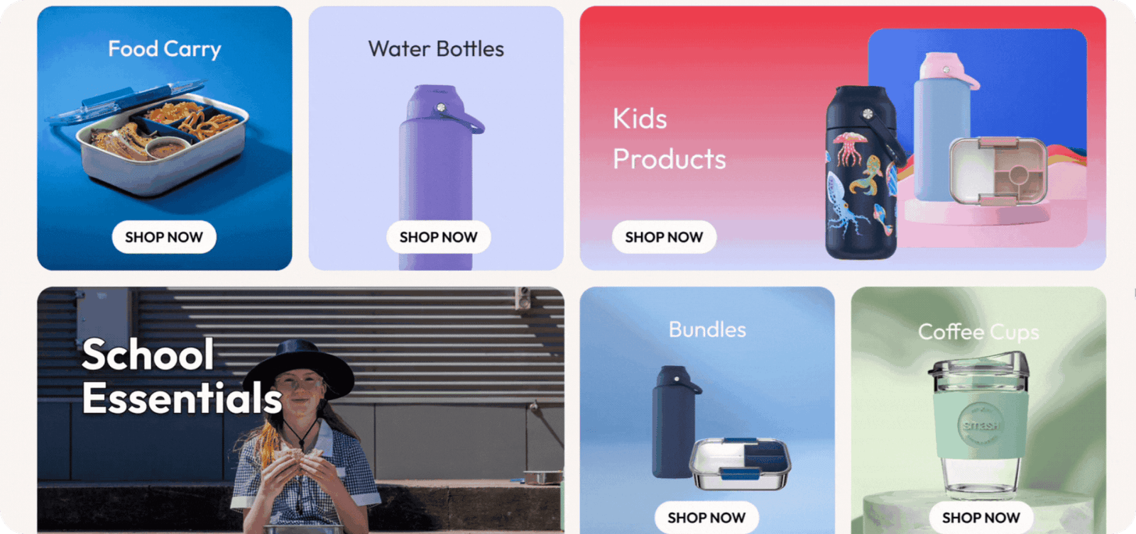
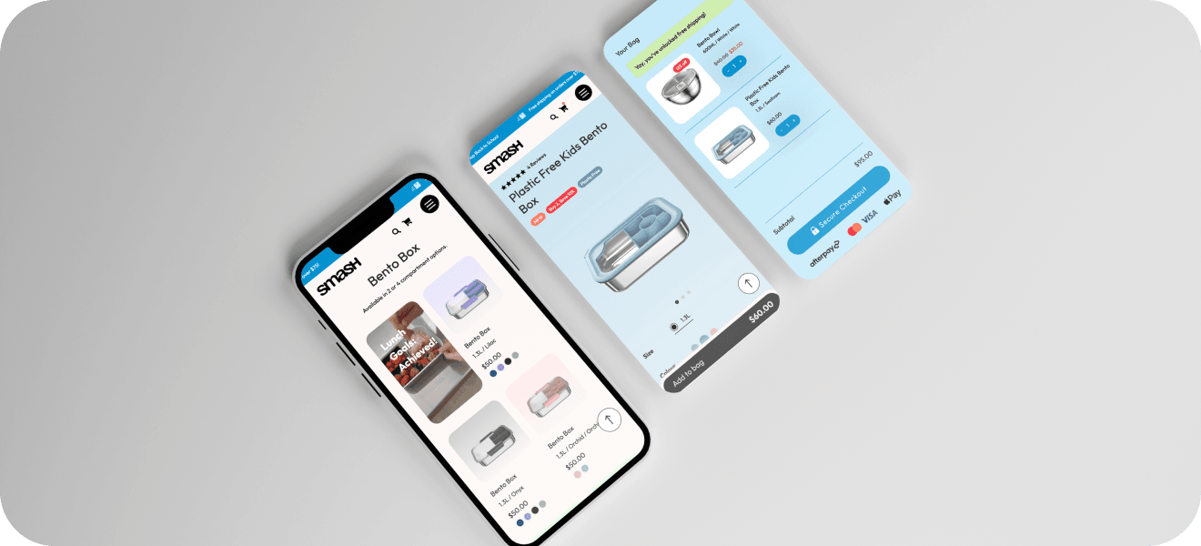
We started by restructuring the information architecture and user journeys, removing friction points and improving product discovery, cross-selling and add-on visibility. The goal was to encourage exploration while keeping the path to purchase clear and intuitive.
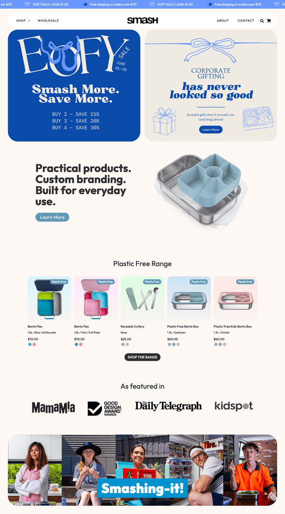
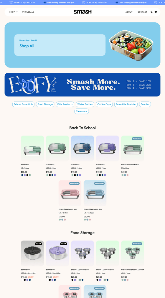
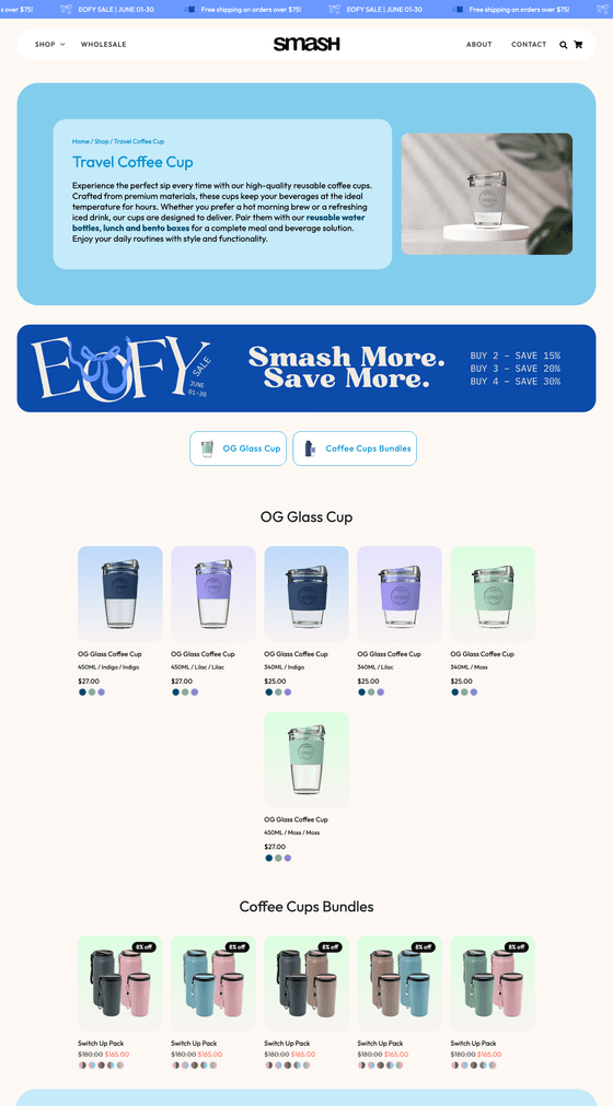
Visually, we leaned into Smash's playful brand personality. Each product colour was given its own unique gradient that carries through the site, reinforcing brand recognition and creating a cohesive, thoughtful experience. Interactive animations, micro-interactions and hover states were layered throughout the site to create a tactile, engaging experience that invites users to play.
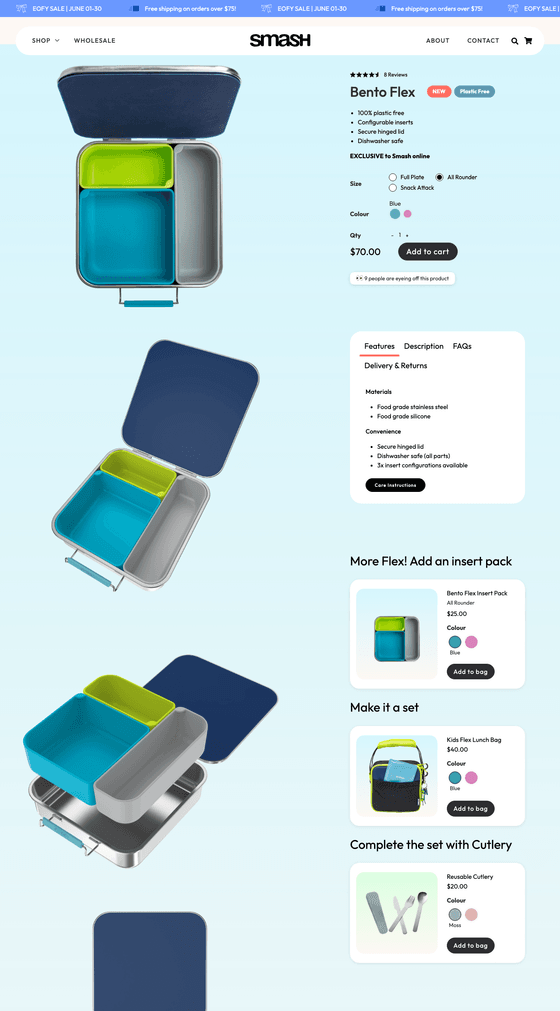
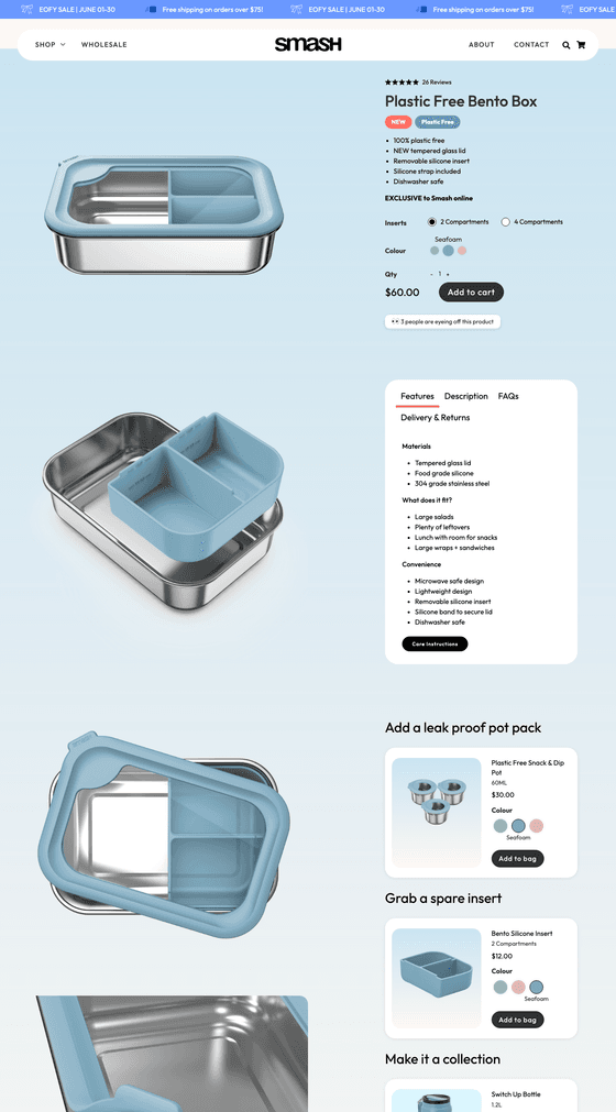
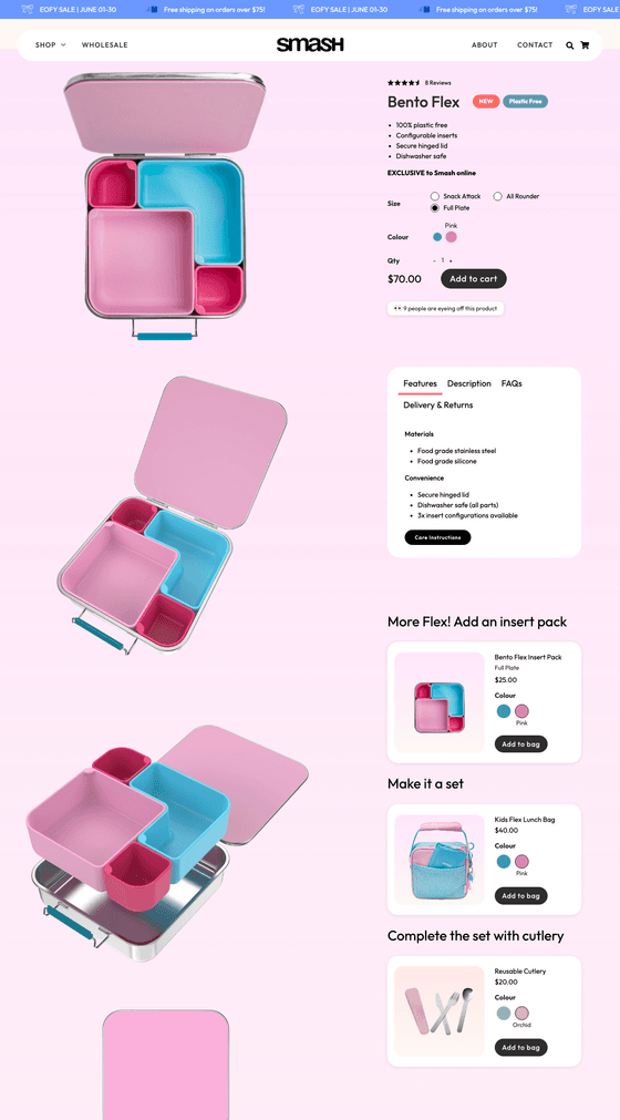
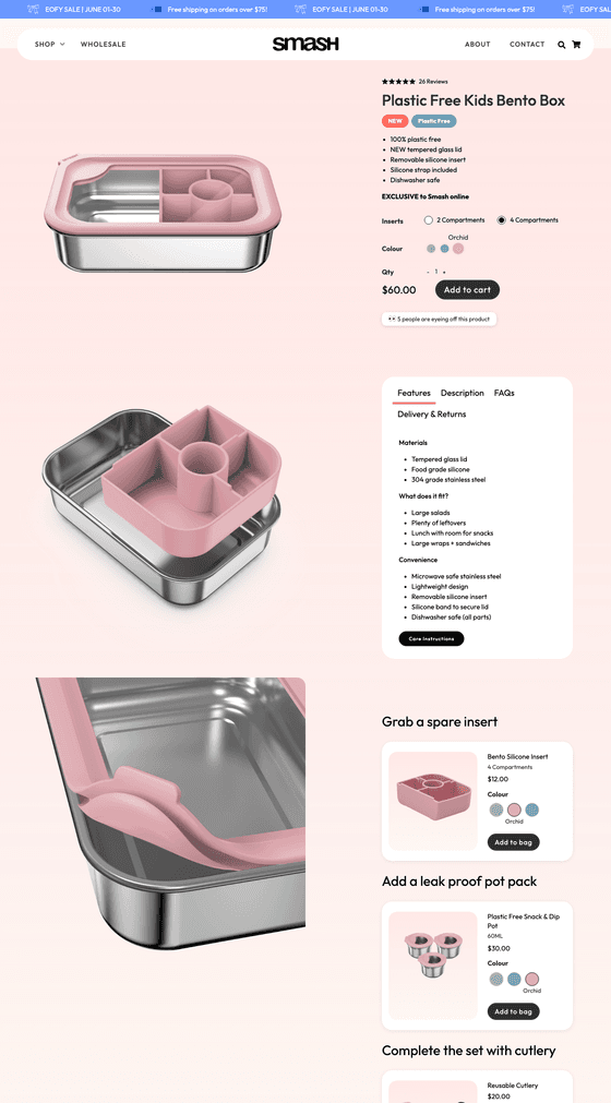
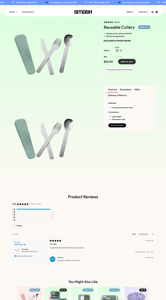
To hero the products, we introduced GIFs and close-up details across category and product pages, showcasing products in action while clearly communicating quality, sustainability and key features. Products were given space to breathe, allowing their design and value to shine.
We also designed a flexible system of site takeovers for sales and campaigns, allowing Smash to transform the site seasonally while maintaining UX consistency. These takeovers follow users throughout the site and include placements across banners, homepage heroes, category tiles, dedicated campaign categories, and sale messaging on category and product pages. Each campaign has its own visual personality, tailored for moments like Back to School, Christmas, Black Friday and Afterpay Day.
To increase engagement and ownership, we introduced a Build Your Own feature, enabling customers to customise products by colour and components. The entire site was designed mobile-first, ensuring the same playful experience across all devices.
Beyond launch, we continue to test, iterate and optimise. Recent enhancements include intelligent product recommendations for spare parts at both product and cart levels, improving usability while driving incremental revenue.
Engagement up. Conversions up. Brand elevated.
The Results
The redesigned Smash website delivered significant commercial and behavioural improvements.
Since launch, Smash has seen an 80%+ increase in sales, driven by a 22% uplift in purchase conversion rate and a 21% increase in average spend per user. Improved product discovery and clearer shopping pathways led to a 149% increase in product views, encouraging users to explore, customise and add more items to cart.
Engagement across the site also increased substantially, with:
- 40%+ growth in user engagement
- 64% increase in total interactions
- 48% increase in scroll activity
- 30%+ growth in total users, including strong growth in returning customers
Together, these results demonstrate how strategic UX and playful, interactive UI design can directly drive conversion, order value and long-term growth.
Designed an experience, not just a website
Any other Notes
The Smash website is a clear example of how thoughtful UX strategy paired with confident, playful UI can drive real commercial outcomes. Every design decision — from animations to layout to customisation — was made with the user in mind.
The result is a website that feels joyful, intuitive and unmistakably Smash — while delivering strong, scalable results for the business.
"The Unmarket team are incredibly responsive and consistently deliver at pace while maintaining a high standard of work, which makes collaboration easy and effective. Their ability to pair strong creative execution with data-led decision making has been a huge asset to our business. Their approach has helped us sharpen our marketing and turn it into real, profitable results. Cannot recommend them highly enough."
Smash E-commerce Manager