Brand Book & Guidelines
Rules that protect your brand and empower your team
Brand guidelines create consistency across every touchpoint — from social posts to packaging to investor decks. They're the rulebook that ensures your brand looks and sounds like itself, no matter who's executing.
More importantly, they empower your team to make confident decisions without constant oversight. Clear guidelines mean faster output, fewer revisions, and a brand that stays cohesive as it scales.
Without guidelines, every touchpoint becomes a gamble
When there's no single source of truth for your brand, every designer, copywriter, and agency partner interprets things differently. The result is inconsistent outputs, a diluted identity, and hours wasted re-explaining what your brand should look and sound like.
Brand guidelines eliminate the guesswork. They give everyone a clear framework to work within — so your brand stays recognisable, professional, and aligned, no matter how many people are contributing.
What brand guidelines include
Logo usage, colour systems, typography rules, imagery direction, tone of voice, layout principles — everything needed to keep your brand consistent.
Why they matter
Guidelines turn brand strategy into actionable rules. They ensure everyone — designers, copywriters, partners — produces work that feels cohesive.
Our approach
We build guidelines that are practical, not theoretical. Clear rules, real examples, and usable templates so your team can apply them immediately.
What we focus on
- Logo and identity usage rules
- Colour and typography systems
- Photography and illustration direction
- Tone of voice and messaging
- Templates and application examples
Guidelines should make your team faster, not slower.
Who it's for
Growing businesses, teams with multiple contributors, brands working with external agencies. Anyone who needs consistency without micromanagement.
The outcome
A comprehensive, usable brand book that keeps your identity consistent across every platform, campaign, and team member.
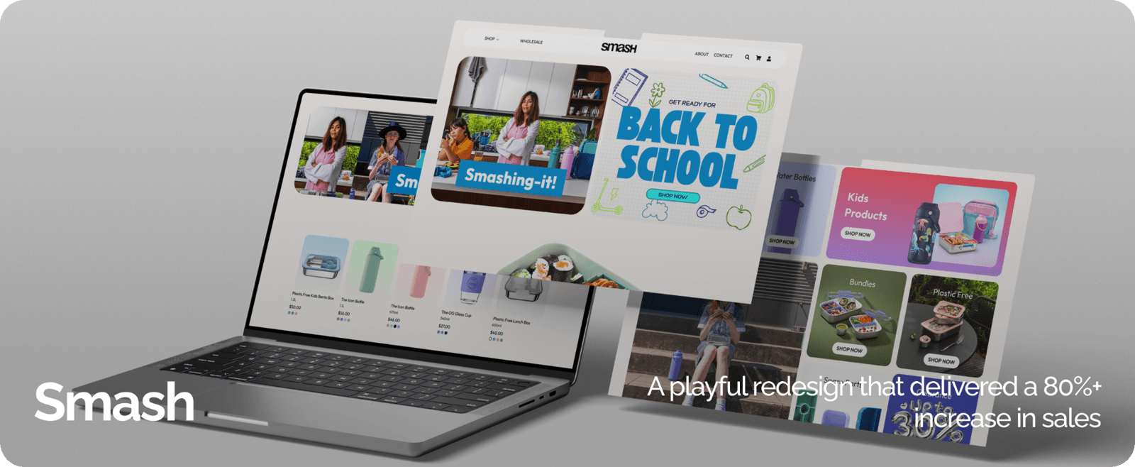
Smash
Playful UX that delivers serious growth
A bold eCommerce redesign that transformed browsing into buying. Through interactive UX, product customisation and conversion-led design, Smash achieved 80%+ sales growth, higher order values and a standout brand experience.

Australian Lighting
Project Description
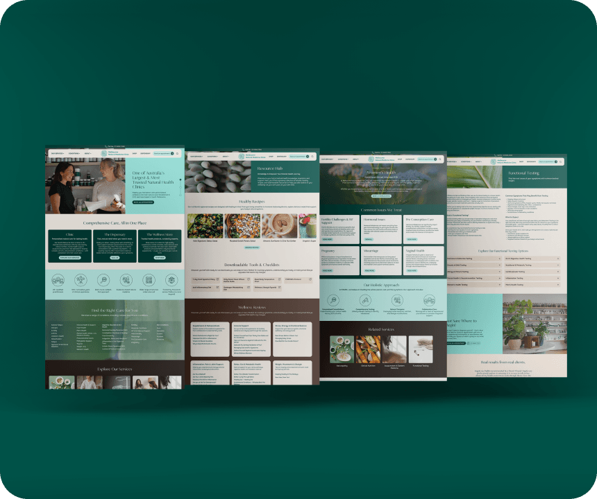
Melbourne Natural Medicine
Clarity, empathy and structure — redesigned to convert
A complex, content-heavy medical website reimagined with user empathy at its core. By restructuring information, improving discoverability and rewriting content to validate patients, enquiries increased by 566%.