Year
2025
Turning complexity into clarity for better patient outcomes
The Challenge
When too much information becomes a barrier
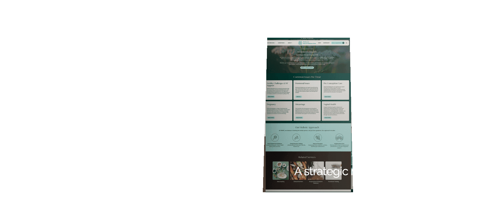
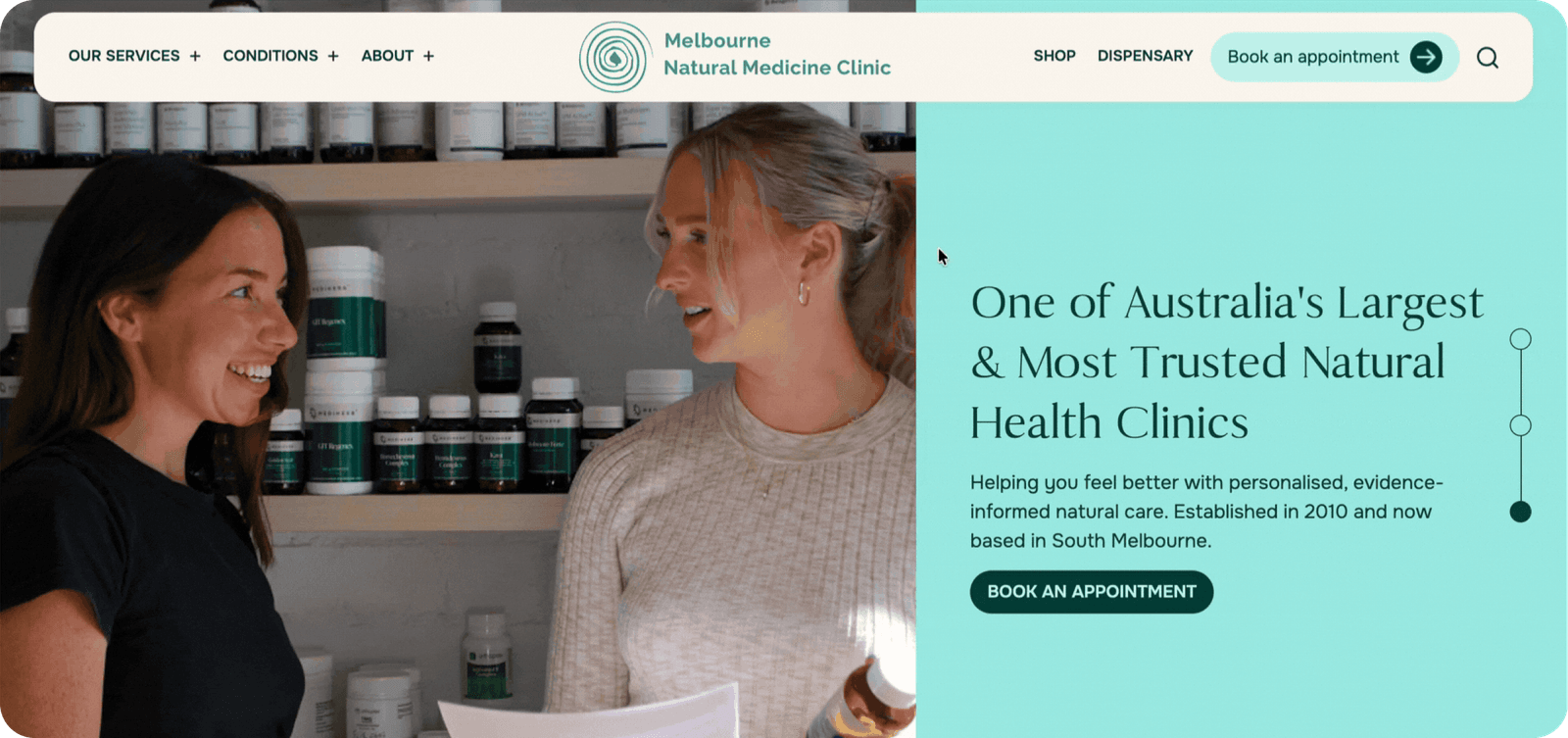
Melbourne Natural Medicine Clinic came to us with a website that wasn't performing — despite having a lot of content. Years of growth, relocations and SEO work by multiple agencies had left the site bloated, poorly organised and difficult to navigate. Users struggled to find relevant information, trust signals were buried, and the visual design no longer reflected the clinic's modern, premium physical space.
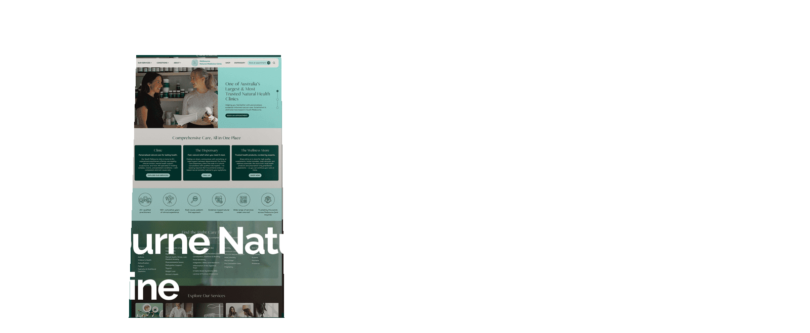
The clinic had recently moved into a beautifully designed new location, but their digital presence hadn't kept pace. They needed to improve discoverability, build trust with new patients, and ultimately increase enquiries — all while presenting complex medical information to users with vastly different levels of health literacy.
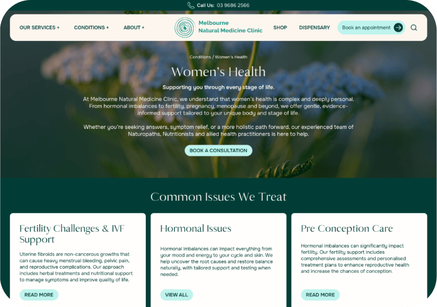
Rebuilding the information architecture with empathy at its core
What we did
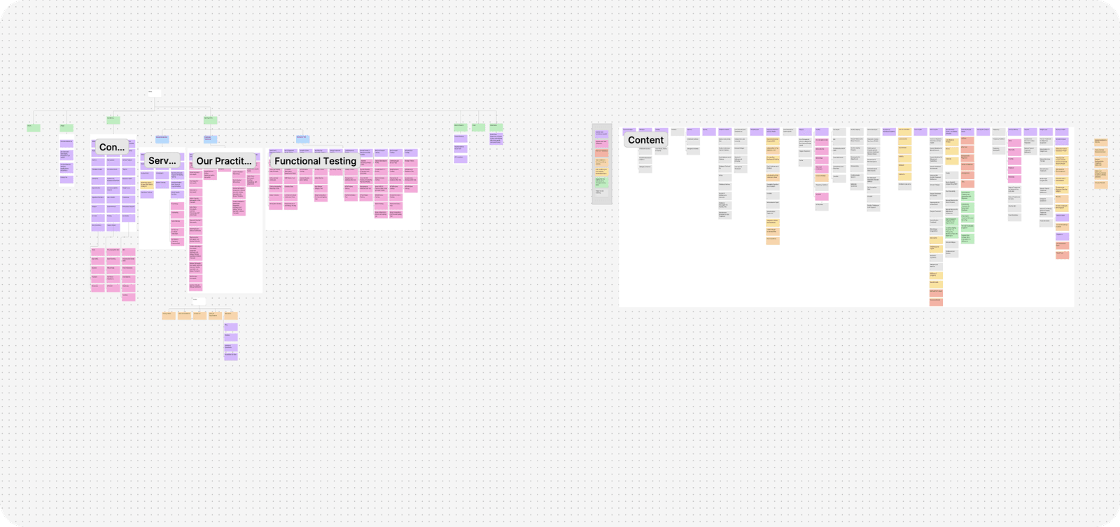
This project began with UX strategy, not visuals. We knew that clarity, empathy and structure would be critical to success.
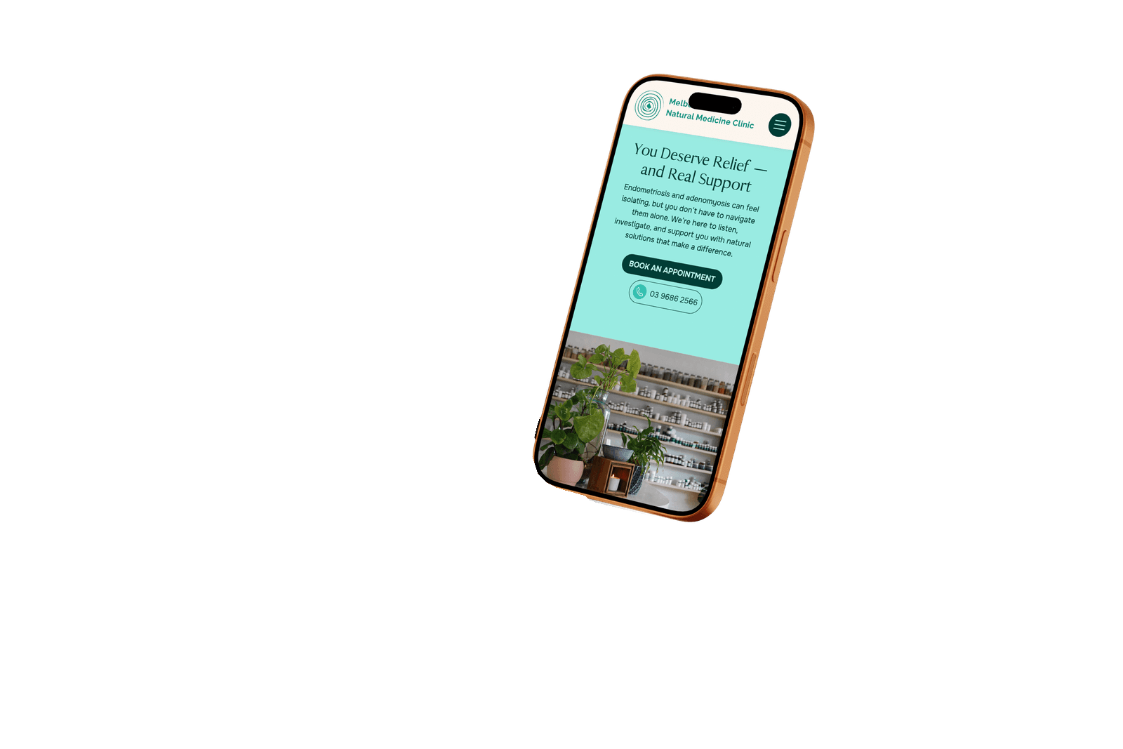
We conducted extensive card sorting and content mapping exercises, carefully analysing how users might search for information based on symptoms, conditions, services or tests. We tested, debated and refined until the structure felt intuitive — even for users who didn't know the "right" medical terminology.
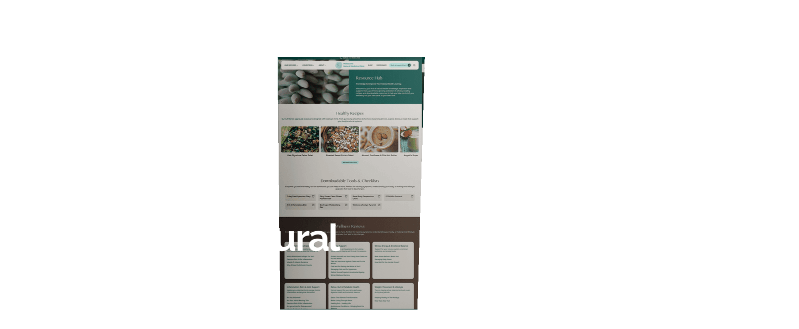
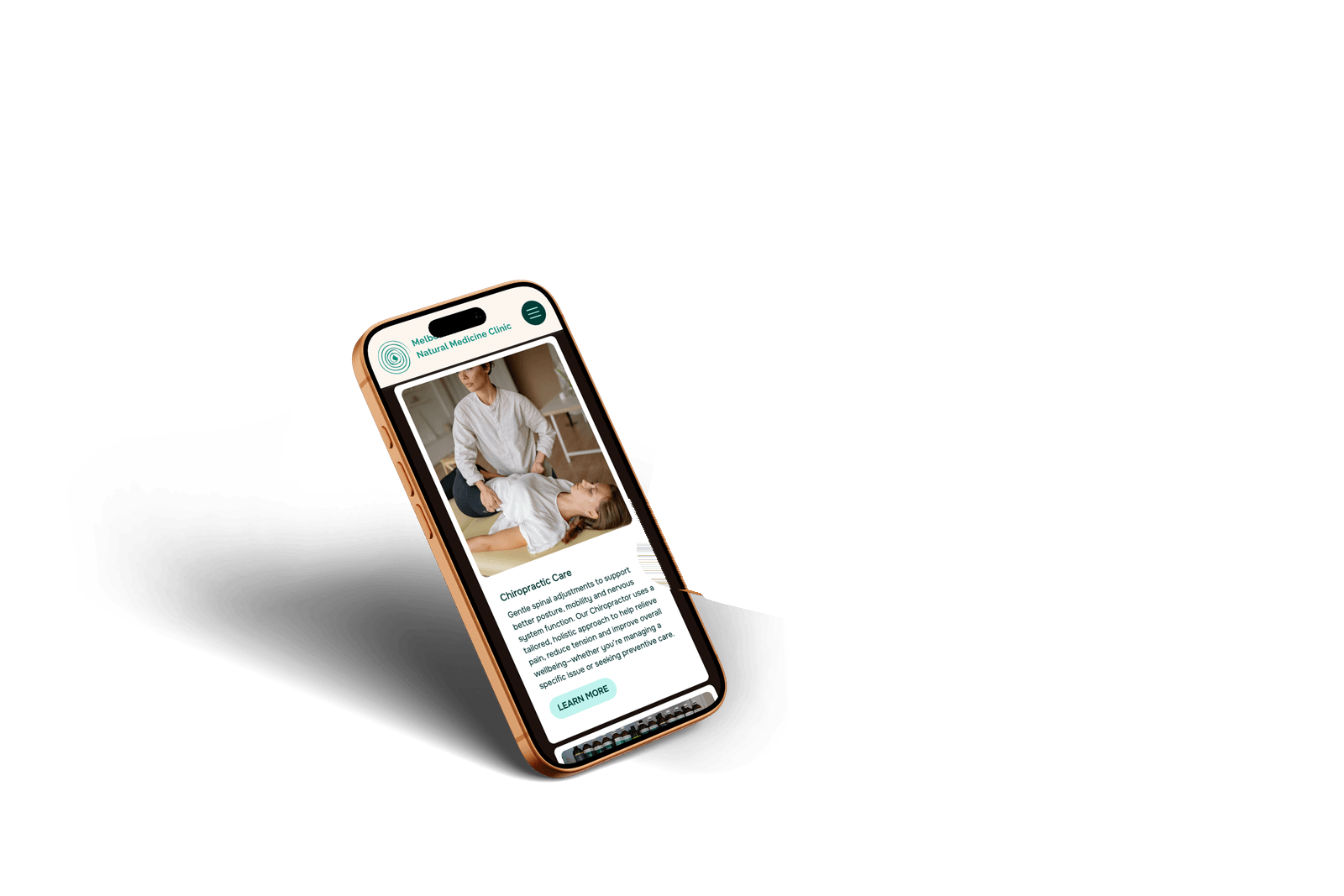
We developed a new, scalable content system that reorganised the site into three primary pathways:
- Conditions
- Services
- Tests
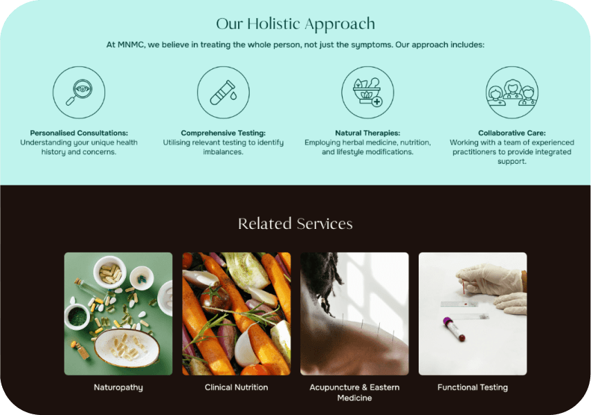
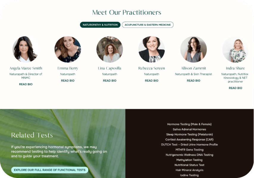
Each was further subcategorised for easy scanning, then deeply interconnected to maximise discoverability. Condition pages link to relevant tests, services and practitioners; test pages connect back to the conditions they support; services reinforce outcomes and next steps. This web of connections ensures users always know where to go next.
We also performed a full content audit and cleanup, removing outdated, irrelevant and low-value pages — including legacy SEO content that no longer aligned with the clinic's offering. We guided the client through rewriting content using consistent, scannable templates designed to answer real patient questions quickly and clearly.
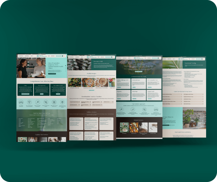
Alongside the structural work, we delivered a complete visual refresh. The site was modernised with updated typography for improved readability, a refined layout system, and the introduction of teal into the colour palette to align with the clinic's calming, contemporary fit-out.
More clarity, more trust, more new patients
The Results
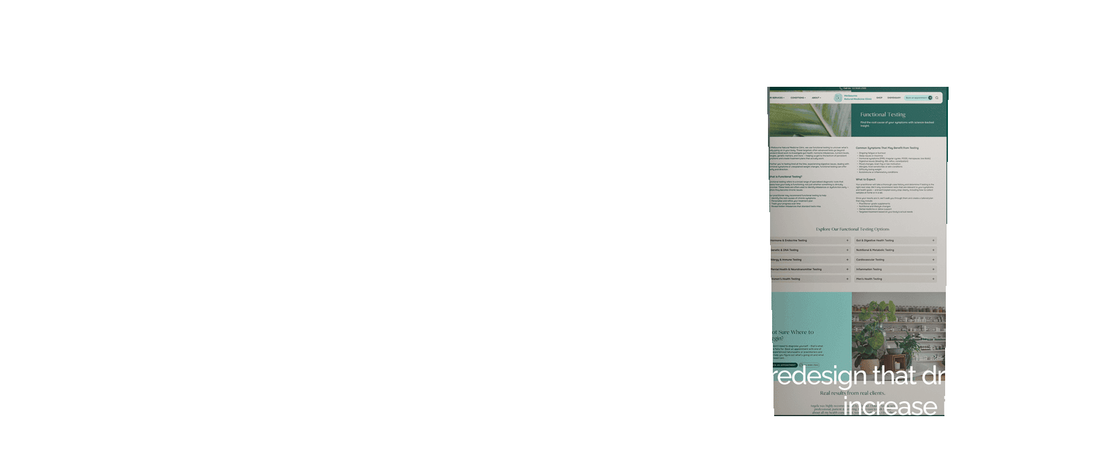
The redesigned website significantly improved both user engagement and conversion performance:
- 566% increase in form submissions
- 48% increase in phone enquiries
- 19% increase in average engagement time
Users are finding information faster, understanding their options more clearly, and feeling confident enough to take the next step. The clinic now consistently receives positive feedback from patients about how helpful and reassuring the website feels.


Designing for people who feel unheard
Any other Notes
A key insight from the client shaped everything: many of their patients come to them feeling frustrated, dismissed or unheard within the traditional medical system.
This became the foundation of the site's tone of voice. Every page was rewritten with empathy in mind — acknowledging symptoms, validating lived experiences, and reassuring users that they are not alone. Calls to action were reframed to offer hope and encouragement, gently prompting users to book an appointment and take steps toward feeling better.
The result is a website that doesn't just inform — it listens, reassures and supports. A digital experience that mirrors the care patients receive in person.