Design Direction & Tone of Voice
Look right, sound right, feel right
Aligning your visual identity and verbal identity ensures every touchpoint feels intentional and consistent. When your brand looks and sounds like itself everywhere, audiences notice — and trust follows.
We help brands define the design direction and tone of voice that bring clarity to how they present themselves, from first impression to long-term loyalty.
When visuals and voice don't align, trust breaks down
Inconsistent design and messaging confuse audiences and weaken brands. When your website says one thing, your social channels say another, and your sales materials feel like they belong to a different company, people hesitate.
Alignment creates recognition and trust. A cohesive visual and verbal identity gives your audience confidence that they're dealing with a brand that knows who it is.
What design direction covers
Visual identity: colour, typography, imagery, layout principles. It's the system that ensures everything looks like it belongs together.
What tone of voice covers
Verbal identity: how your brand speaks, writes, and communicates. From headlines to help text, tone shapes perception.
Our approach
We audit existing materials, research your audience, and define clear visual and verbal guidelines that your team can actually use.
What we focus on
Our design direction and tone of voice work typically includes:
- Visual identity systems
- Typography and colour palettes
- Tone of voice guidelines
- Content style guides
- Application across channels
Consistency isn't about rigidity — it's about recognition.
Who it's for
Brands that feel visually inconsistent, tonally confused, or misaligned across channels. Especially valuable during growth, rebrand, or market expansion.
The outcome
A unified design and verbal system that makes your brand instantly recognisable and effortless to apply across every channel and format.
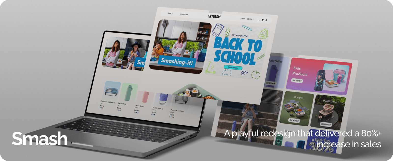
Smash
Playful UX that delivers serious growth
A bold eCommerce redesign that transformed browsing into buying. Through interactive UX, product customisation and conversion-led design, Smash achieved 80%+ sales growth, higher order values and a standout brand experience.
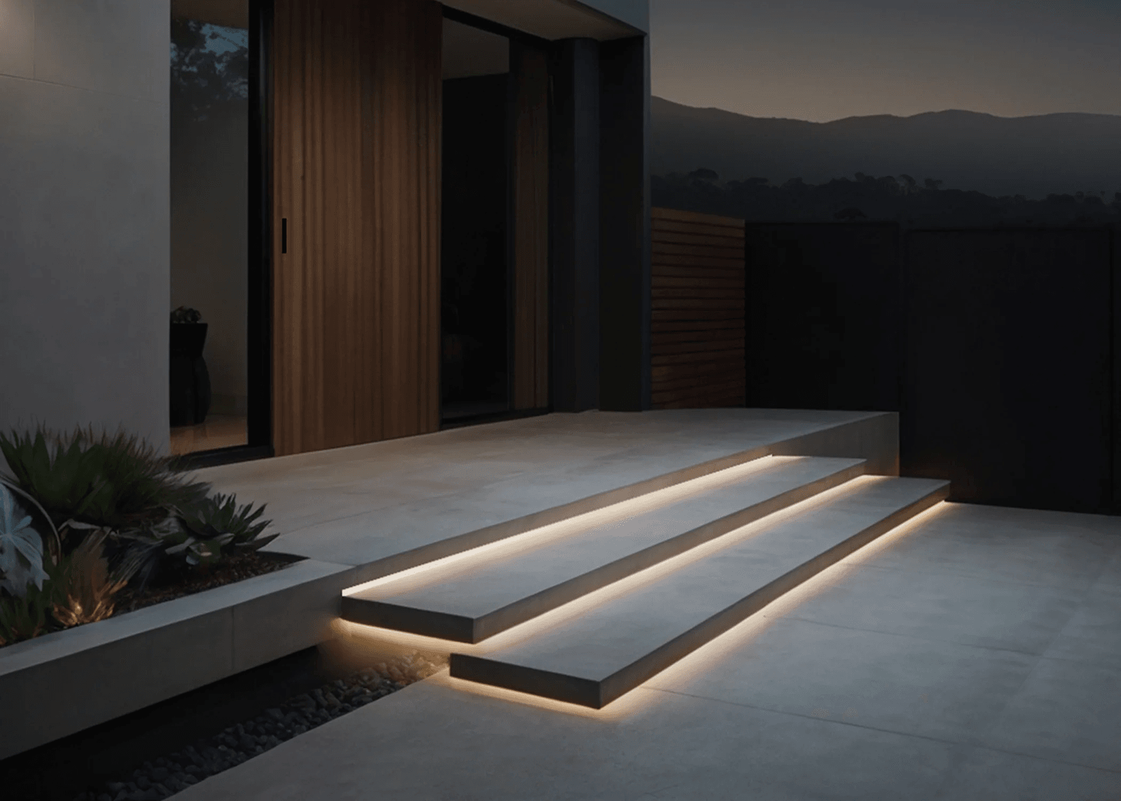
Australian Lighting
Project Description
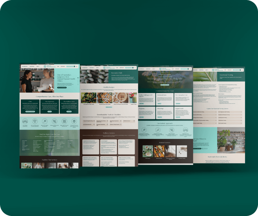
Melbourne Natural Medicine
Clarity, empathy and structure — redesigned to convert
A complex, content-heavy medical website reimagined with user empathy at its core. By restructuring information, improving discoverability and rewriting content to validate patients, enquiries increased by 566%.